FAQ
Are that many colors really necessary?
No, absolutely not. Some of them are in fact completely ludicrous.
For example if you know any language in which static async enum members are a thing I would love to see it. On the bright side, that means that not every single color needs to be the most beautiful tone, and also that I don't need to worry about the contrast between some of the colors if one of them is a super weird or even impossible edge case.
Some of those colors seem pretty close to each other, is it really possible to tell them apart?
It is true that some colors would be hard to distinguish in isolation but in the actual code tokens are literally surrounded by context. You'd be surprised how many slight differences you pick up subconsciously after a while.
But some of them seem pretty much identical?
That would be the declaration styles. That's because they are mainly differentiated from other tokens by being shown in italics.
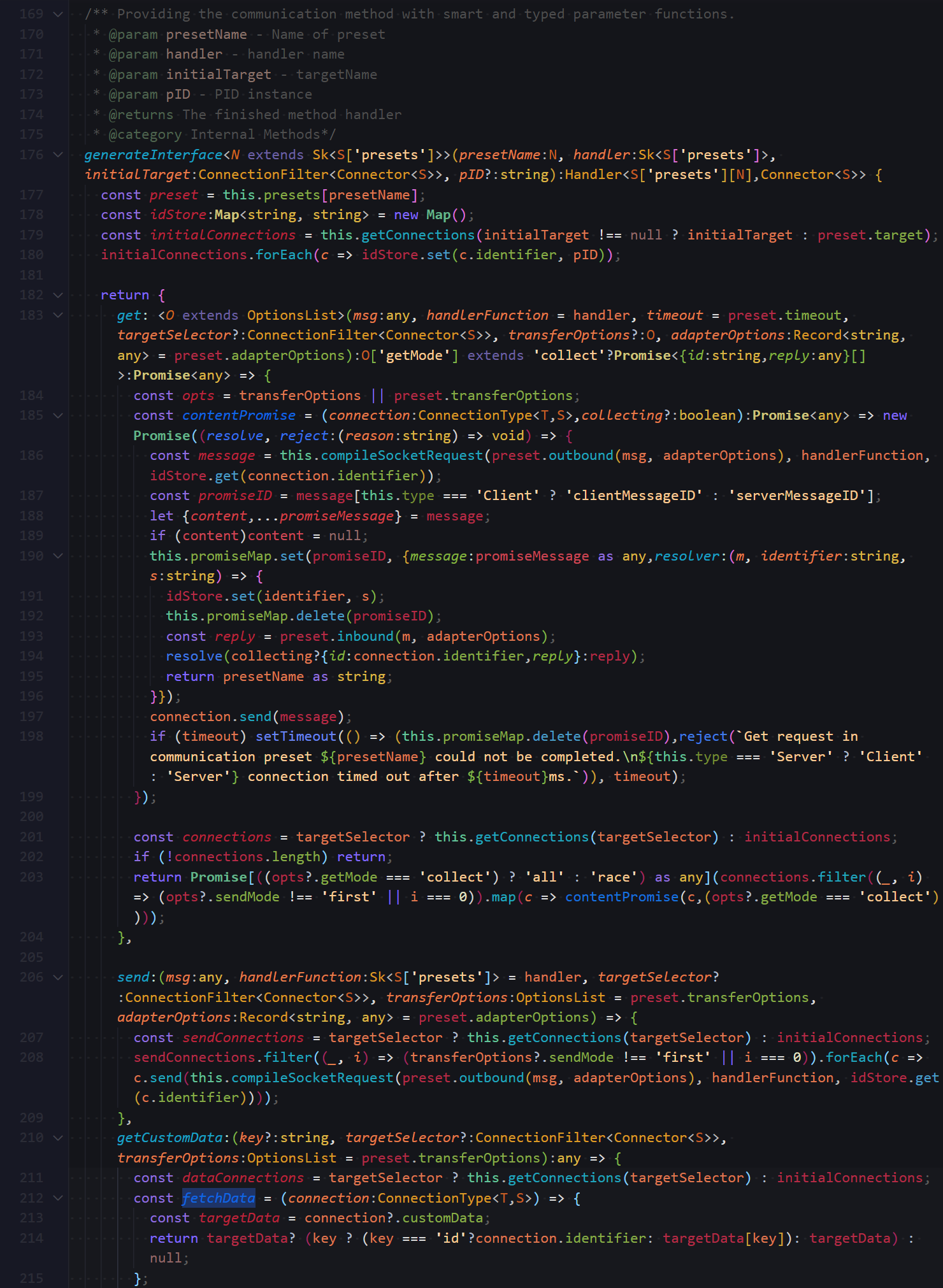
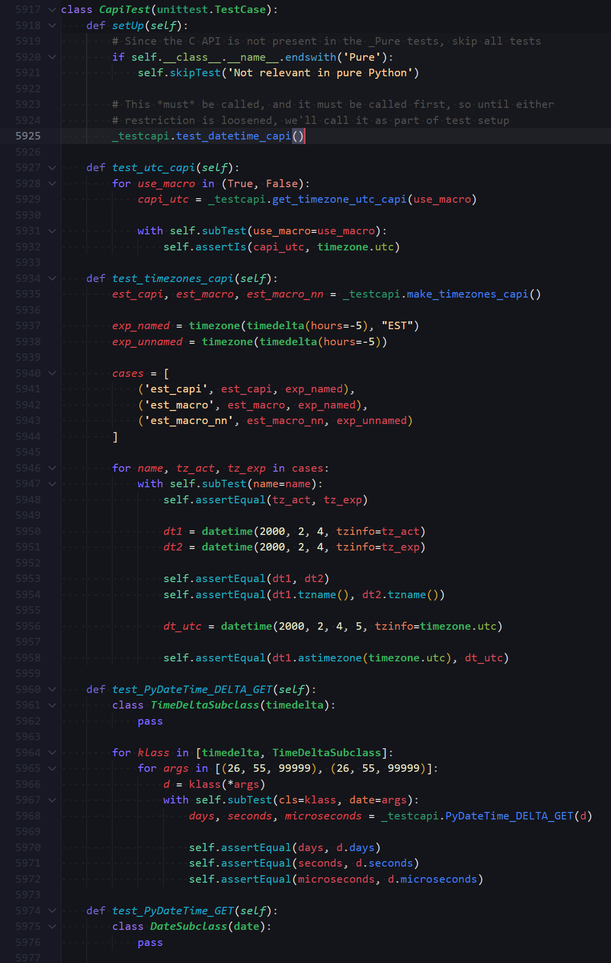
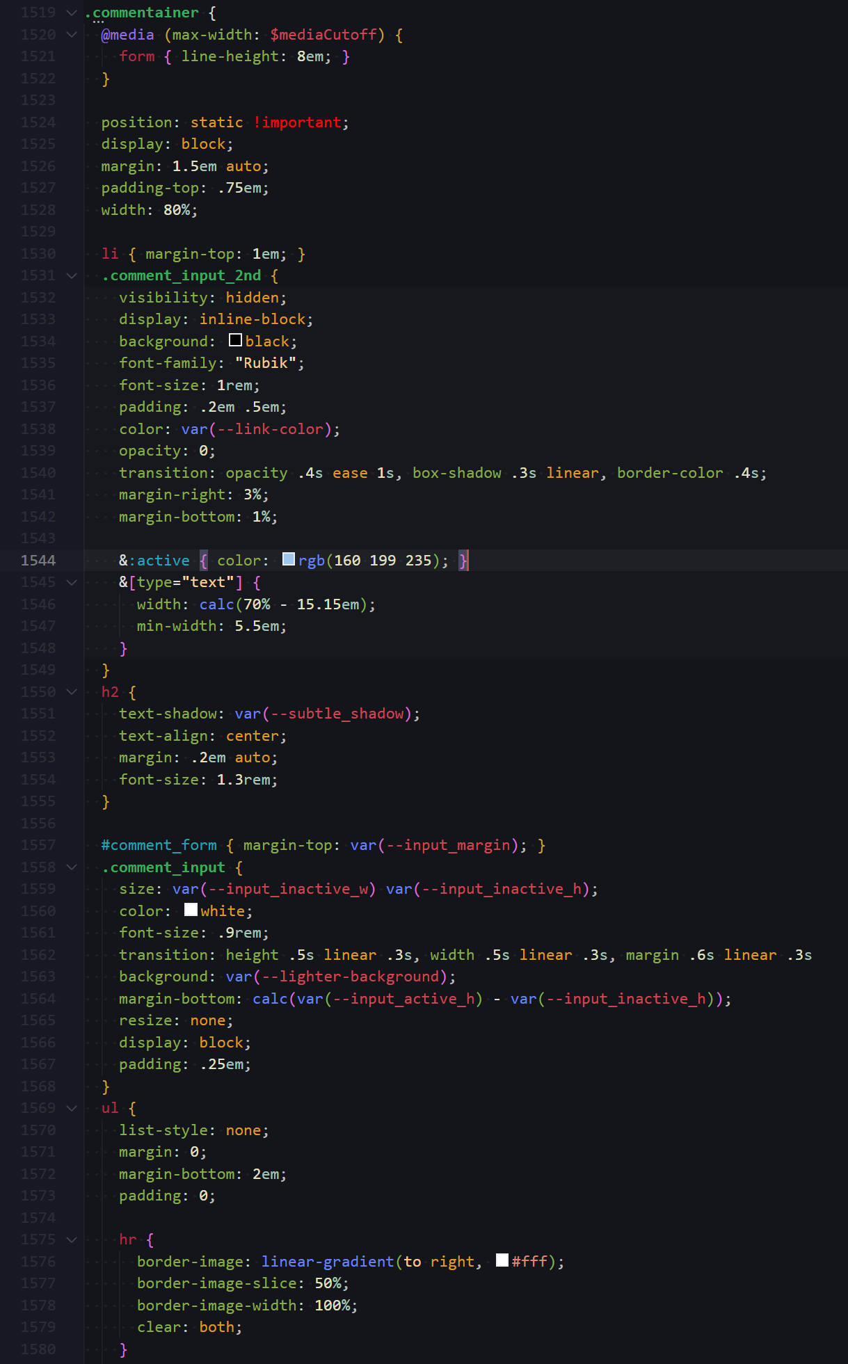
Which languages are used to test this Theme?
I am mainly testing in TypeScript, Python, Lua, CSS/SCSS and HTML. I am not opposed to include other languages in the future.
I can't get the private token modifier in TypeScript to work, am I doing something wrong?
No, the private modifier isn't implemented in the Typescript language server yet. The token is included partly just top be future proof and partly because other language servers are already supporting it (Java for example).
Design Philosophy
First off, here is why I generally think this theme might work for you.
As for the colors themselves, I am not going to pretend that I went into this project with a definite concept and a background in color psychology. Many of these color associations emerged basically on their own as I was tweaking colors back and forth and later I went back to figure out how they might work.
The key to making a Theme with this many colors work without things getting too confusing is to create a spectrum in which colors do not arbitrarily representi keywords but instead represent different concepts and roles in the program, and based on this spectrum colors are assigned to the different tokens.
The spectrum that emerged for this particular theme is the following:
Red: Values/Information
Purple: Keywords/Flow Control
Blue: Action/Transformation
Green: State/Storage
Yellow: Definitions/Primitives
Anything directly containing a discrete piece of information is red. This is where your variables and constants reside. They are so to speak the lifeblood flowing through the code and whenever you see red, you know information is being accessed and processed.
Blue is the color for change and transformation, in other words: Functions, since they generate and modify other information. To put it in more poetic terms information flows through them like water.
Green is for anything that is stateful or defines a state. Here we find properties that set the state within an object, namespaces which represent groupings of information a and classes which are of course also stateful. (Surely you could argue that variables are also "stateful" but they only represent their own singular state at the time).
Yellow jumps out at you as a sort of signal, for example a type signalling exactly what static (at least in TS) kind of data a certain parameter or variable expects. It also occurs where we see "raw" primitive data being defined such as a string representing nothing other than itself, or boolean values.
These are the main components and for most other tokens deciding which color to assign them is a matter of interpolation.
For example methods are midway between the blue of functions and the green of classes, representing them being being influenced by the specific state of their containing context.
keywords like return, for, var, etc direct information, true but information around themselves depending on what they represent so they stand between blue transformation and red information.
Parameters are orange because in addition to storing values like regular variables they veer slightly in the direction of statefullness (green), as they represent the specific state of a single execution of a function.
Numbers are slightly more greenish yellow than other primitives since they represent a very discrete state and enums are more yellow than namespaces and classes because they are basically a state solely defined by such primitives.
And so on and so forth, for basically every token this kind of reasoning is applied, if only post-hoc.
Up to this point everything has been about the hue of the colors. Other color properties can be used to convey even more information. The next color rule used in Semantic Rainbow is the following:
Saturation and Vibrance are mapped to control and mutability.
The bolder the color the more "dynamic" the value it represents. A rewritable variable or property has a saturated and bright red and green respectively, but when something cannot be reassigned like a constant or a readonly property that color will darken, appear not as prominent, a more stable and calmly enduring entity.
There are of course even more ways to modify a color to be less vibrant and saturated besides dimming it towards black, it can also be bleached towards white, or generally faded using alpha. These different ways to reduce vibrance are used to represent different ways in which tokens differ. Anything belonging to a default library is shown desaturated and brightened. Being predefined, they are outside our control and their coloration reflects that indirectness. And once properly supported private properties and methods will be designated with a slight transparency, as they are ephemeral and only exist in specific contexts.
And finally going completely beyond color into text formatting:
Any time any value is declared or initialized, the token will be displayed in italics. Also classes are shown in bold to distinguish them more effectively from namespaces and highlight their special role in object oriented programming. I am not using the underlined font style because I don't think it ever looks good.
The purpose of Semantic Rainbow is to extract all information your code can provide. I hope this concept shows how this wealth of information can still be handled in an intuitive manner.
Colored Highlights and Ranges
In addition to the usual coloring of tokens version 1.1.0 of Semantic Rainbow introduces special coloring for highlighting and ranges used for several VSCode features. The default colors for most of these different highlights are neutral greys, making it hard to distinguish by which means a selection or highlight was created, and I felt it was in the maximalist spirit of the theme to overhaul their appearance and give each type of selection an easily identifiable color.
At the same time, since most of the token colors are rather vibrant, selections and and ranges are generally assigned more restrained colors.
Manual selections are still presented in a neutral grey, while the highlighting of identical text has a slightly less opaque appearance. The selected highlighting in inactive documents has a different shade, designed to pair well with the search highlight color since when switching between matches the highlighting of the current search match is technically inactive.
The matches of a search are highlighted in green, with a more subtle and subdued green designating the range of the search, if the search is limited to a specific area. Other generic range highlights used by quick open and find features are highlighted in a paler and brighter shade of green. Find matches in the peek view editor have a turquoise background.
If a specific symbol is selected, its other instances are highlighted in a steely blue with a more vivid coloration designating a write-access.
When merely hovering over a symbol, a subtle orange highlight is applied, since at this point other more prominent hover actions like tooltips also appear the highlighting does not need grab attention unless it is applied to a larger range.
The highlight color for snippet tab stops is purple, a stronger color than usual as it signifies the need for user-action and the highlighting of the final tab stop uses the same color but slightly more intense.
And finally, the Symbol Highlight is an eye-catching orange, chosen because it is only visible for a blink of less than a second when skipping to a symbol definition.


